Blog
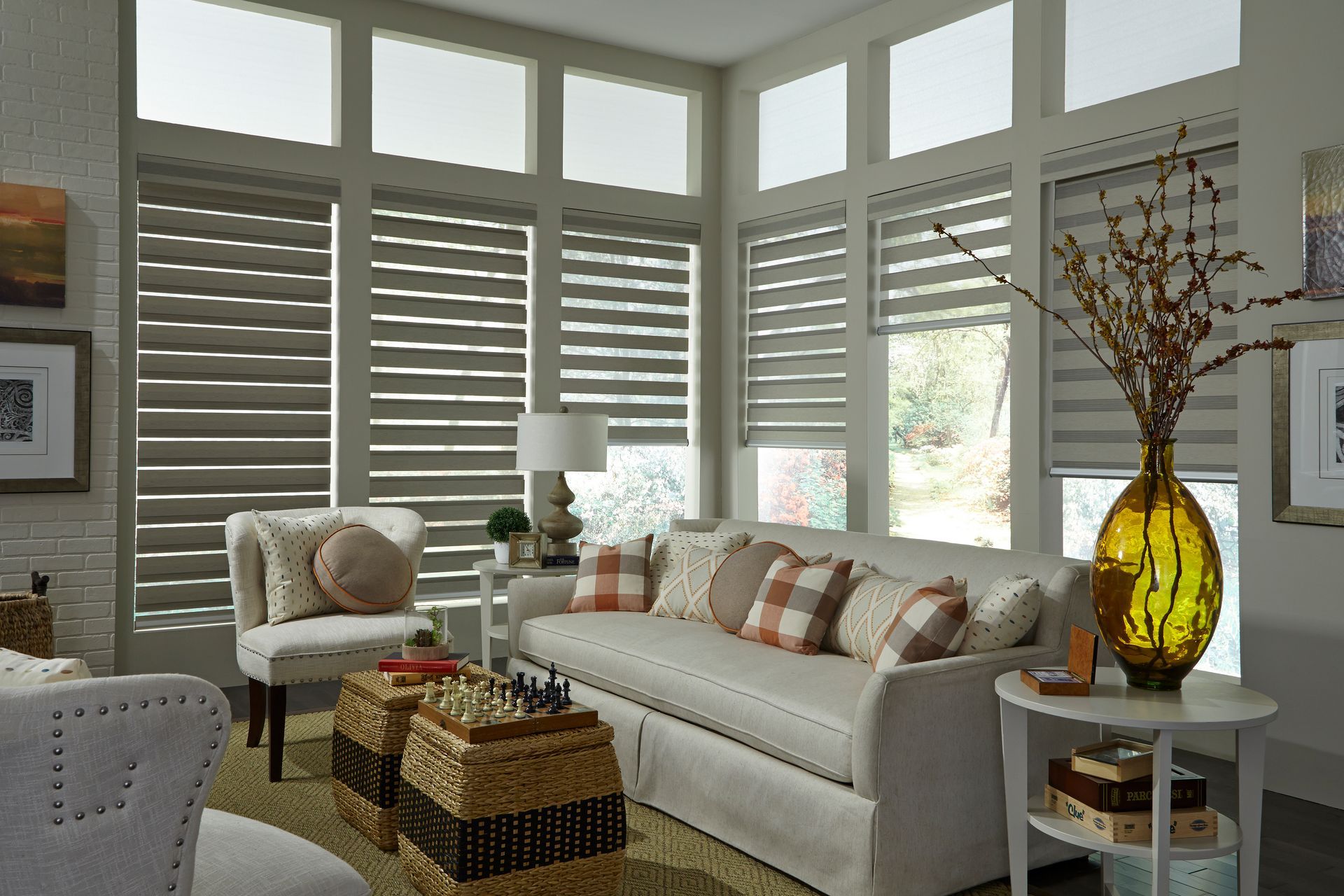
When it comes to creating a comfortable and stylish home, window treatments often take center stage. Blinds and shades are not just practical additions to control light and privacy; they also contribute significantly to the aesthetic appeal of your living spaces. Choosing the right blinds or shades can transform any room into a haven of style and functionality. Why Blinds and Shades Matter Windows are the eyes of your home, offering a glimpse of the outside world while inviting natural light inside. The right blinds and shades allow you to control how much light enters your space, manage indoor temperatures, and ensure privacy when needed. Whether you’re redesigning a single room or tackling a whole-home makeover, window treatments are a vital part of the equation. Types of Blinds and Shades Here are some of the most popular options to consider: Roller Shades: Sleek and versatile, roller shades come in a variety of colors, patterns, and fabrics. They’re ideal for creating a clean, minimalist look. Roman Shades: These classic shades fold neatly when raised and lay flat when lowered, adding a touch of elegance to any room. Cellular Shades: Also known as honeycomb shades, these are excellent for insulation and energy efficiency. They trap air in their unique cellular design, keeping your home comfortable year-round. Wood and Faux Wood Blinds: Timeless and durable, these blinds bring warmth and texture to your interiors. Faux wood options are also moisture-resistant, making them ideal for bathrooms and kitchens. Vertical Blinds: Perfect for sliding doors or large windows, vertical blinds provide a practical solution without sacrificing style. Motorized Shades: For ultimate convenience, motorized shades let you control your window treatments with a remote or even your smartphone. Ideal for hard-to-reach windows or tech-savvy homeowners. Choosing the Right Style for Your Space Selecting blinds or shades depends on your specific needs and design goals: For Privacy: Opt for blackout shades or tightly fitting blinds to keep prying eyes out. For Light Control: Consider light-filtering options or dual-layer blinds that offer both sheer and opaque settings. For Style: Match the color, material, and design of your window treatments to your home’s overall decor. Professional Installation Matters While DIY installation can be tempting, professional installation ensures that your blinds and shades fit perfectly and function smoothly. Experts can also provide advice on the best options for your home’s unique layout and design. Why Invest in Quality Window Treatments High-quality blinds and shades are an investment in your home’s comfort and value. They’re more durable, easier to maintain, and offer better functionality than cheaper alternatives. Plus, they can enhance your home’s energy efficiency, saving you money in the long run. Final Thoughts Blinds and shades are more than just a finishing touch—they’re a key component of your home’s design and functionality. Whether you’re aiming for sleek modernity, cozy warmth, or classic elegance, there’s a window treatment to suit every style and need. Ready to elevate your home? Explore our wide range of blinds and shades to find the perfect fit for your space. Your windows will thank you! Schedule your free in-home window treatment consultation today at www.paintcle.com/lafayette

Choosing the right colors for painting the interior of your home can feel like an overwhelming task. With countless shades, tones, and finishes available, it’s easy to get lost in the sea of possibilities. However, understanding the basics of color psychology, trends, and practical tips can simplify the process and help you create a space that’s both aesthetically pleasing and functional. This blog post will guide you through the factors to consider when selecting colors for your home’s interior. Understanding Color Psychology Colors have the power to influence our emotions, behavior, and even the perception of space. Before diving into specific hues, it’s essential to understand how colors impact mood and functionality: Warm Colors: Shades like red, orange, and yellow evoke energy, warmth, and vibrancy. They’re great for social spaces like living rooms or dining areas where you want to encourage interaction. Cool Colors: Blues, greens, and purples tend to create a calming and relaxing atmosphere, making them ideal for bedrooms and bathrooms. Neutral Colors: Whites, beiges, and grays offer versatility and timelessness. They work well in any room, either as the main color or as a backdrop for bolder accents. Dark Colors: Deep hues like navy, charcoal, or forest green can add sophistication and drama but might make small rooms feel confined if not balanced with lighter elements. Assess Your Space Before selecting colors, assess the characteristics of each room: 1. Natural Light Natural light significantly impacts how colors appear: Rooms with ample sunlight can handle darker or bolder colors without feeling oppressive. Spaces with limited natural light benefit from lighter shades that reflect light and make the room feel larger and brighter. 2. Room Size Colors can alter the perception of space: Light colors create an open, airy feel, making small rooms appear larger. Dark colors add depth and coziness but may make compact spaces feel smaller. 3. Existing Elements Consider the room’s fixed elements, such as flooring, furniture, and architectural details. A cohesive color palette ties these features together, creating a harmonious look. Color Palettes and Combinations 1. Monochromatic Scheme This approach uses varying shades of a single color for a cohesive and understated look. For example, pairing pale blue walls with navy accents and soft gray furnishings creates a serene environment. 2. Analogous Scheme Choose colors that sit next to each other on the color wheel, such as green, blue, and teal. These combinations feel natural and pleasing to the eye, ideal for creating flow between rooms. 3. Complementary Scheme Pair colors opposite each other on the color wheel, like blue and orange or purple and yellow. This bold approach adds energy and contrast to a room but should be used in moderation to avoid overwhelming the space. 4. Neutral Palette A palette of whites, grays, or beiges creates a timeless and versatile foundation. Use pops of color in decor, like pillows, rugs, or artwork, to add personality. Room-by-Room Guide 1. Living Room As a central gathering space, the living room should feel inviting and comfortable: Opt for warm neutrals like beige or taupe for a welcoming backdrop. If you’re adventurous, try an accent wall in a bold shade like teal or terracotta. 2. Kitchen Kitchens benefit from bright and clean colors that evoke freshness: Whites, soft grays, and pastel yellows work well. Consider a pop of color on cabinetry or a backsplash, like navy blue or emerald green. 3. Bedroom For restful sleep, prioritize calming hues: Soft blues, greens, and lavender promote relaxation. Avoid overly stimulating colors like red or bright yellow. 4. Bathroom Bathrooms can be tranquil or invigorating, depending on your preference: Whites and light grays create a spa-like atmosphere. Add a playful touch with patterned tiles or a colorful vanity. 5. Home Office Stimulate productivity with colors that enhance focus: Greens are great for creativity and balance. Blues promote concentration and calmness. 6. Kids' Rooms Incorporate fun and personality with playful hues: Bright colors like orange or turquoise can inspire energy. Soft pastels work well for younger children and create a soothing environment. Trends in Interior Paint Colors While timeless choices always have their place, staying aware of current trends can add a modern touch: Earthy Tones: Colors inspired by nature, such as sage green, terracotta, and clay, continue to be popular. Deep Jewel Tones: Rich shades like emerald green, sapphire blue, and burgundy add luxury and depth. Greige: A blend of gray and beige, this versatile color complements various styles and furnishings. Soft Blacks: A muted black creates drama without overwhelming a space, perfect for accent walls or trim. Practical Tips for Choosing Paint Colors 1. Test Samples Never rely solely on a color swatch. Paint sample patches on your walls and observe them at different times of the day under varying light conditions. 2. Start Small If you’re unsure, experiment with a smaller space like a powder room or hallway before committing to a larger room. 3. Consider Finishes The paint finish can affect how a color looks and performs: Matte/Flat: Best for low-traffic areas; hides imperfections. Eggshell/Satin: Slight sheen; ideal for living rooms and bedrooms. Semi-Gloss/Gloss: Durable and reflective; great for trim, doors, and kitchens. 4. Balance Bold Choices If you choose a bold wall color, balance it with neutral furniture and decor to prevent the room from feeling chaotic. 5. Use Color Apps Many paint brands offer apps that let you upload a photo of your room and virtually test colors. This can provide a sense of how different shades will look in your space. Common Mistakes to Avoid Ignoring Lighting: Always account for the natural and artificial lighting in your space. Overloading Bold Colors: Use vibrant colors sparingly to avoid overwhelming the room. Neglecting the Flow: Ensure that colors transition smoothly from one room to the next for a cohesive look. Skipping Preparation: Proper surface preparation ensures the best finish and longevity for your paint job. Final Thoughts Choosing interior paint colors is a deeply personal process that reflects your style and the atmosphere you want to create in your home. By understanding color psychology, assessing your space, and following practical tips, you can confidently select shades that enhance your living environment. Whether you lean towards timeless neutrals, bold statements, or trendy hues, the right colors will bring your vision to life and make your house truly feel like home.